Design Kit
EDSnext Figma Design Kit
Access the complete design kit with all components, tokens and guidelines from EletroDS to build consistent and scalable interfaces for Mercado Eletrônico.
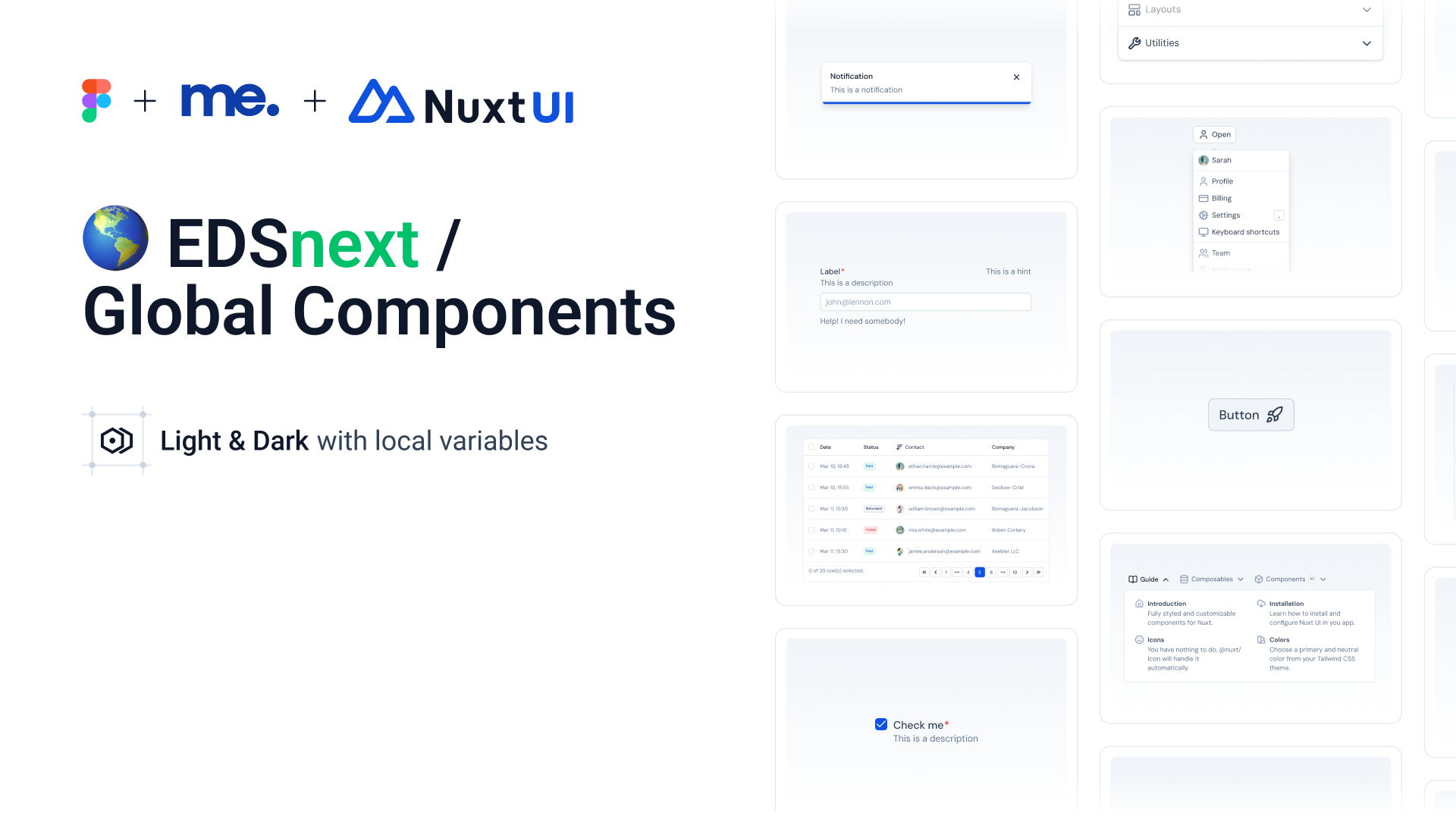
What's included
Everything you need to create
A complete kit to align design and development across Mercado Eletrônico.
Component Library
All EletroDS components faithfully recreated in Figma with proper constraints, auto-layout and integrated documentation.
Design Tokens
Color palettes, typography, spacing and other tokens as native Figma variables and styles.
Templates & Patterns
Ready-to-use templates and design patterns to accelerate workflows across Mercado Eletrônico products.
Figma Variables
Full support for Figma variables enabling light/dark theming and quick customization per context.
Accessibility
Components documented with focus states, contrast ratios and accessibility annotations for WCAG AA.
Synced with Code
The Figma kit is kept in sync with the EletroDS Vue 3 component library.
Design Tokens
Variables & styles
437 variables organized into collections — colors, typography, spacing, radius and breakpoints — with native Light and Dark theme support in Figma.
Primary
25 variables
Neutral
28 variables
Success
23 variables
Error
25 variables
Warning
23 variables
Secondary
25 variables
UI Colors254
Tokens80
Font37
Spacing38
Radius6
Breakpoints18
Documentation
Ready to develop?
EletroDS is available as a Vue 3 library. Check the installation guide and start using the components in your project.